Marist’s New Logo: Evolution or Imitation
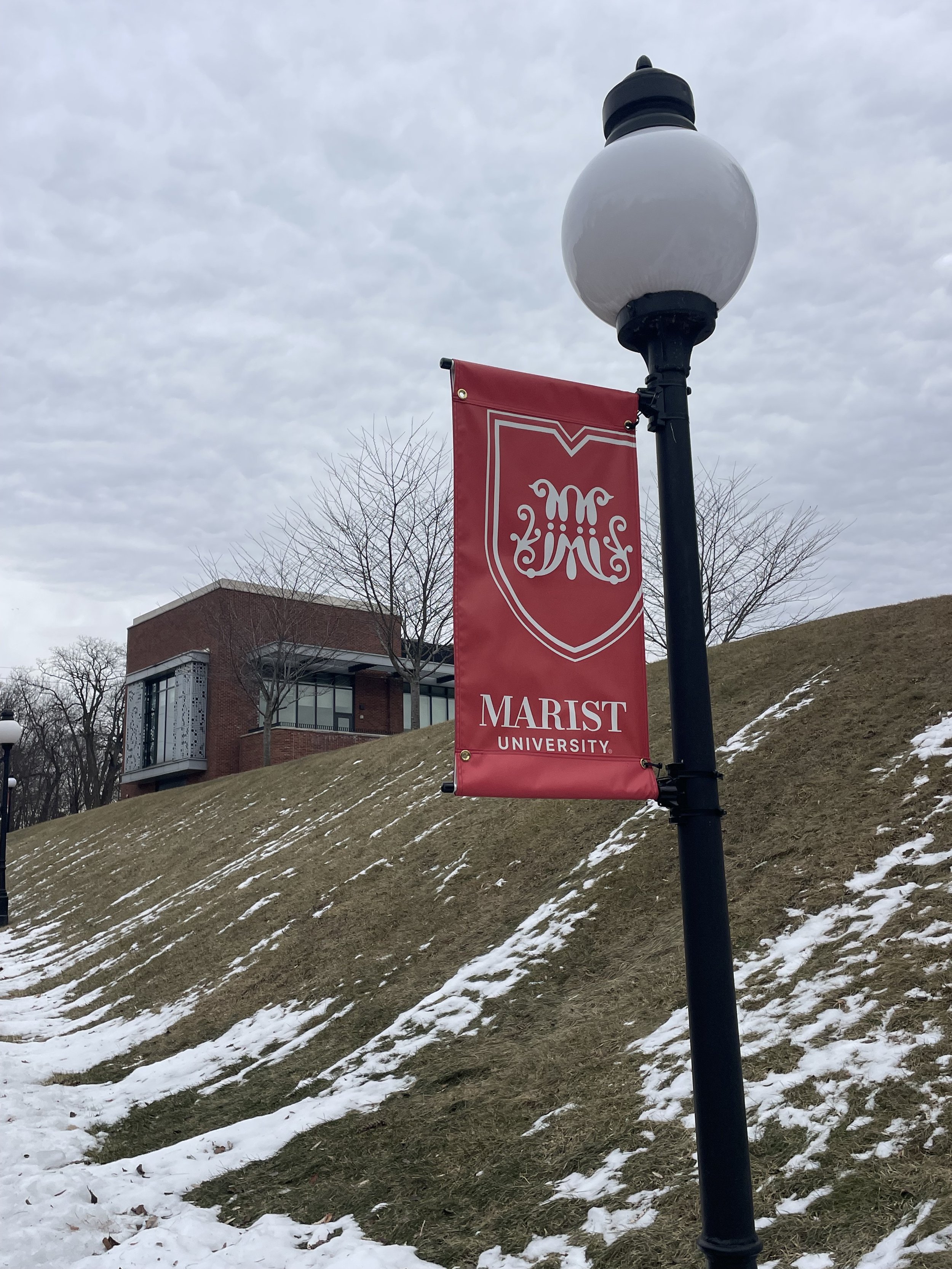
New Marist University logo displayed on lamp post banners across campus. Photo by Amanda Nessel '25
Marist University marked the start of a new chapter with a single symbol – a shield representing its rise to university status.
At first glance, the redesign makes sense. Becoming a university calls for an upgraded identity, and the shield – a widely recognized symbol in academia – positions Marist alongside established institutions.
While the logo successfully modernizes and elevates Marist’s image, it raises an important question; does this new identity truly reflect what Marist is?
The previous nameplate logo was simple and clean, but as the school grows, a stronger, more symbolic visual identity is necessary. The shield introduces a distinctive emblem rather than just a wordmark, giving Marist a new visual anchor.
Inside the shield, the Marist Brothers’ script “M” nods to the university’s origins, maintaining a connection to its history. Previously, the Marist Brothers’ “M” was only featured in the seal; now, it is a core part of the logo, blending well with the modern shield design. The shape is sleek and minimalistic, setting it apart from traditional university shields.
This balance between honoring the past and looking towards the future is crucial in maintaining Marist’s identity as it evolves.
Shields are a staple in higher education branding, symbolizing strength, tradition and prestige. Many top universities, such as Harvard, Princeton, Yale and the University of Pennsylvania, use them to showcase history and legacy. By adopting this well-known academic symbol, Marist visually asserts its place among respected institutions.
In contrast to these institutions, Marist is unveiling this symbol for the first time. This prompts us to consider whether this is a genuine evolution of Marist’s brand or an attempt to conform to a mold.
Marist is known for its close-knit community, strong student-faculty relationships and collaborative spirit. It is a place that values growth over prestige. The school’s strength doesn't come from aligning with external perceptions of prestige but from the values it has built over time. I believe that this makes Marist more appealing to prospective students, so why try to pretend to be something we’re not?
While the shield raises questions about why it is only now becoming part of Marist’s visual identity, the design choices ensure it still feels like Marist.
Rather than choosing a classic, historically styled shield, Marist selected a modern design. Its sharp, clean lines offer a fresh feel, and subtle details, such as the top resembling an “M,” set it apart.
Rather than simply adopting an academic norm, the school has created a visual identity that reflects its path forward. The new logo blends tradition with growth by keeping the nameplate and adding the shield, striking a balance between those who value the school’s roots and those excited about its future.
Some students expected the fox, a new font for “Marist” or something entirely different.
In terms of student reception, the new logo has caused confusion. Some students are not fans of the inclusion of the script “M,” saying it looks strange against the modern shield. Others don’t understand the significance or think that we went back in time with the new look.
Personally, I was glad to see Marist did not jump on the minimalist rebranding trend. It’s nice to see the nameplate alongside a new graphic rather than just another take on the letter “M.”
While the new logo isn’t groundbreaking, it is a thoughtful change that’s easy to implement. Keeping the nameplate means that most of the university’s branding will remain familiar, while the shield creates a new visual element.
Additionally, the typography stays true to Marist. The new font is almost identical to the old one, with angular slab serifs instead of curved ones- what designers call an “unbracketed serif.” This modern tweak complements the sharp edges of the shield and keeps the overall look polished.
Unlike some universities ditching serifs for sleek sans-serif fonts, Marist’s choice keeps a sense of sophistication.
Ultimately, the shield serves its purpose: it gives Marist a more substantial, more recognizable mark. Whether it becomes an enduring symbol of the university or just another rebrand remains to be seen.